IN WHAT WAYS DOES YOUR MEDIA PRODUCT USE, DEVELOP OR CHALLENGE FORMS AND CONVENTIONS OF REAL MEDIA PRODUCTS?
For my Advanced Portfolio in Media, I undertook the number 1 brief. For this I had to create a new music video, an accompanying website homepage to advertise the band and a Digipak for the album.
I came up with the idea that so as to make my project even more fun to do that instead of a normal pop music video I would go with a parody. There are many parodies out there on sites such as YouTube, both ones that amateurs create on their afternoons off school, college or work, right through to the likes of Weird Al Yankovic who has made a name for himself as a parody artist and as a result, this has enable him to have massive budgets when creating his new music videos which ultimately enables a better video to be made which can result in a larger audience choosing to view his work.
When researching into existing products, I looked for a key set of things.
- Who are the target audience of other parody artists and how would I target an effective audience for my own music video?
- What do people look for in a parody? How would I incorporate the things the people like most in order to create a good product myself that people will enjoy possibly more than existing ones?
- How do people access parodies? How will I make sure that my parody is accessible?
To collate this information, I took the liberty to ask a group of 30 people of varying ages both male and female to fill out a paper copy survey that I created.


Here was the survey which I created. It gave me a good idea of what people were looking for and what people were looking for it.
 From the feedback of this survey in addition to an online survey I conducted on www.surveymonkey.com, I decided that I wanted to make a parody of a well known pop song. After much deliberation and thought about what song would make a good parody, I eventually went for Rizzle Kicks - Down With The Trumpets, in which I would re-write and create my very own song in which I titled, Down With The Crumpets, and later thought of a name for my new parody band. I went for Nizzle Flips. I went with the option of parodying this song as I felt it had the opportunity with the lyrics it had to parody pretty easily in addition to the fact it is a song many people know well, and from the feedback I received was one of the things people look for most in a parody... the fact they know the original song well.
Music Video
Forms and conventions are what make up media products. How do they work? What things are used? How effective are they?
In my research I looked at how existing products use certain things and the ways they make them what they are and that they are so successful.
I decided to go with the method of the artists lip syncing the way through the song. I felt this was a popular method to use so I conformed to this convention. I feel it gives the audience a connection to the artist if they can see them actually singing the song to them. I feel that with parodies this is exceptionally important as the audience look to engage with the artists. I did consider for the choruses that I wouldn't use lip syncing to mix it up a bit and that I would go for the all action dancing about and having fun kind of method with the lip syncing sticking to the verses only. During filming for the choruses I filmed versions where the two singers were joined by 3 backing dancers and were all just dancing and having a good time in addition to similar shots but with the 2 singers also singing along. In the editing process I decided that I would instead just go with the clips of the singers actually singing along. I felt it would have a better flow when all put together than if I didn't have lip syncing on the choruses.
One of the main conventions of a parody music video is the help of acting to help tell a story. I felt this was crucial in my music video. As my song is titled - Down With The Crumpets I decided that with the help of the two main singers/actors in my music video would help tell a story of how they are in a morning during breakfast time in the first verse leading on to a message in the third and final verse to the women in their lives and how they would act if they finally got their woman that they have each longed for for so long. The idea I went for was to basically incorporate food into the song and video as much as I could and as such you will see a lot of items that are mentioned in the lyrics displayed in the video.

As you can see from the image below the video you can easily tell that this is done pretty effectively on a low cost budget. I decided I would use my own home for parts of the filming. Along with fitting into my lyrics pretty well, I became fond of the fact that you can create a good parody music video too by doing so without having to go all fancy.
Here was the survey which I created. It gave me a good idea of what people were looking for and what people were looking for it.
 From the feedback of this survey in addition to an online survey I conducted on www.surveymonkey.com, I decided that I wanted to make a parody of a well known pop song. After much deliberation and thought about what song would make a good parody, I eventually went for Rizzle Kicks - Down With The Trumpets, in which I would re-write and create my very own song in which I titled, Down With The Crumpets, and later thought of a name for my new parody band. I went for Nizzle Flips. I went with the option of parodying this song as I felt it had the opportunity with the lyrics it had to parody pretty easily in addition to the fact it is a song many people know well, and from the feedback I received was one of the things people look for most in a parody... the fact they know the original song well.
Music Video
Forms and conventions are what make up media products. How do they work? What things are used? How effective are they?
In my research I looked at how existing products use certain things and the ways they make them what they are and that they are so successful.
I decided to go with the method of the artists lip syncing the way through the song. I felt this was a popular method to use so I conformed to this convention. I feel it gives the audience a connection to the artist if they can see them actually singing the song to them. I feel that with parodies this is exceptionally important as the audience look to engage with the artists. I did consider for the choruses that I wouldn't use lip syncing to mix it up a bit and that I would go for the all action dancing about and having fun kind of method with the lip syncing sticking to the verses only. During filming for the choruses I filmed versions where the two singers were joined by 3 backing dancers and were all just dancing and having a good time in addition to similar shots but with the 2 singers also singing along. In the editing process I decided that I would instead just go with the clips of the singers actually singing along. I felt it would have a better flow when all put together than if I didn't have lip syncing on the choruses.
One of the main conventions of a parody music video is the help of acting to help tell a story. I felt this was crucial in my music video. As my song is titled - Down With The Crumpets I decided that with the help of the two main singers/actors in my music video would help tell a story of how they are in a morning during breakfast time in the first verse leading on to a message in the third and final verse to the women in their lives and how they would act if they finally got their woman that they have each longed for for so long. The idea I went for was to basically incorporate food into the song and video as much as I could and as such you will see a lot of items that are mentioned in the lyrics displayed in the video.
My Music video.
Another of the conventions I noticed after looking at other videos was the role of acting within the sequence to help portray more emotion and help tell the story a little bit better than would could be accomplished had only I got the two singers sitting down in front of a camera miming the words to the song. This method also makes it more entertaining to view to the audience and also enhances the ability for the audience to understand what is going off.
DashieXP - Friday
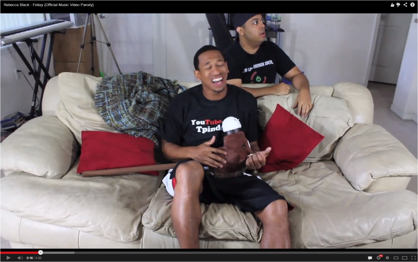
This video (above) is one I found on YouTube from 'DashieXP'. Although the original song it is not a song that I was particularly fond of, it is however a parody music video of a well known song. It has been created on a low budget in his own home by the looks of it. This is the method I had to go down. You can create good videos without having to follow the strict codes and conventions of the higher profile parody artists. Having achieved over 2million views I feel this can be deemed a successful parody song that ventured onto YouTube gaining 'DashieXP' even more publicity.
As you can see from the image below the video you can easily tell that this is done pretty effectively on a low cost budget. I decided I would use my own home for parts of the filming. Along with fitting into my lyrics pretty well, I became fond of the fact that you can create a good parody music video too by doing so without having to go all fancy.
Some parody artists prefer to take the 'mess' out of the artists or perhaps the lyrics with some even taking the opportunity to take the 'mess' out of what the artists do in the music video as is the case with this video from 'Barely Politcal's - The Key of Awesome' series. I enjoyed the idea of this video however for the song I was parodying (Rizzle Kicks - Down With The Trumpets) I felt it would be better to parody the lyrics out of all the options and create DOWN WITH THE CRUMPETS.
Website Homepage
Here is the link to my website: http://andrewlaird1994.wix.com/nizzleflips2
Websites are an important tool to help an artist/band connect with their fans. A websites is a platform in which fans can go and find out more information on their favourite stars to help gain some inside knowledge of what they are like, finding out the latest news and experiences. Such things like tour dates, images and videos are other popular features, all of which I have tried to incorporate into my website homepage.
The first common thing is to see the name of the band/artist (usually coupled with their logo if they have one) at the top of the page with a navigation bar underneath. From the image below you can see I have conformed to this convention as I feel it is not one you can challenge. When someone visits a webpage, the first thing they expect to see is what the page is about and who features on it.

This follows the standard convention used on pretty much all websites. Here are some examples:


All of these examples follow the same rule of having the band/artists' logo/name at the top of the page. Weird Al Yankovic (bottom picture) and Rizzle Kicks (2nd picture down) both have the navigation underneath the title banner. The others, (Olly Murs and Nickelback) are a splash screen sort of style for a homepage but still follow the idea of having the name/logo right at the top of the screen. I have followed on to use this as I feel it is the most effective way for my audience to travel my website. The other alternative was to have the navigation down the left hand side. However, I felt this was not as good of use of space for my website and I also feel that a navigation bar is much easier to view on the top of the screen where visiting audience members can view without having to scroll up and down the webpage trying to find the tab they want as they would with a side navigation column.
The style of homepage I wanted was one that was informative, one that linked itself to other pages on the site rather than cram everything into it rather than on the other side of the dice, one that had no content whatsoever and was much more of a splash page rather than a detailed homepage. I feel that a homepage that has links to other pages are much more effective than ones that simply have a navigation bar along the top without the added touch of a few video clips, image galleries etc.
What I have done is have a little 'taster' of a few different things the site contains and input small chunks of it into my homepage. I feel this was one of the differences I had to other few websites I have looked at previously. I have therefore gone against the convention of having limited things on the homepage so that more information is portrayed to the audience without them having to go searching page after page. All the snippets are on the homepage to browse down and click on the links they like to view the content in more detail on the correct page.
Another key feature of a website is to have links to social media sites. This is so that when audiences visit the webpage, they can see ways of connecting with the band/artist further.
As you can see from this image, I have a "Connect With Us" section with thumbnails which link to Facebook, YouTube, Instagram, Twitter and Google+. This is an important feature for my website to have as fans would like to view as many things as possible about their favourite music stars.

The colour scheme used is vital. A scheme that somehow relates to the artist/band is something that I feel is a crucial component. The website that Nickelback have uses a black and white colour scheme. This is due to the fact they are a rock band and black is the general colour used when portraying the rock genre whereas the colour scheme of Weird Al Yankovic's website is a multi-coloured, fun looking one. This signifies the type of music genre that it is. A parody.
Moving to Olly Murs, his colour scheme appears very sophisticated with neutral colours. This is a reflection on the kind of artist he is.
I have gone for a white background on the main content page with blue boxes and in some points the same blue for the text. Then again for the exterior background of the right hand side content panel which continues across the foot of the webpage.
I chose the blue as it is a bright and bold colour that you could class as a 'feel good' colour. It links in to the fact parodies are a feel good type of music genre and are bright and funny.
Digipak

Digipak's can be varying sizes but I decided the design I wanted to go for was 6 panel one, containing, a front cover, back page with track listing, a CD holder page, lyrics page, a large image from a video shoot and a little message to the fans.
Some of the digipak's I have looked at used the 6 panel design to great effect, enabling plenty of information and images to be displayed to the audience.
The first convention would be to have a house style to the digipak. I have completed all the digipak using 'Segoe Script' and 'Segoe Print'. I looked through many fonts but decided that these would catch the eye of the audience better than maybe simpler fonts such as Arial and Times New Roman would have done. I have used the same font for my logo (Segoe Script) as I have for other page heading etc.The other content (track listing/message to fans/lyrics) use the sister font 'Segoe Print'. As these fonts are part of the same 'family' it looks pretty effective when I merged the two into my house style.
The colour scheme again all links in with other aspects of the artists work. I stuck with the same blue as my website, just as the likes of Rihanna and Oasis did when they're particular albums came out. They would have a colour scheme that ties in with them as an artist that is the same on all platforms of their work.


These are some of the example digipak's I looked at. Firstly, I liked the Rihanna one with the fact that the image spreads across 3 panel, enabling a great rule of thirds convention. Rihanna is spread across the left and central thirds of the digipak. I loved this convention, however, I didn't use the same technique of using one image across the 3 panel, I did however use the rule of thirds on my back (track listing) page.
 As you can see from the image of my back (track listings) page. I have used 6 images of the band, covering the right third and the left third, with the track listing in the centre third. I have chosen this as the track listings I felt needed to be centred as it would be the first thing the audience see.
The thought behind the rule of thirds is that it creates more tension and energy. I think that it in my case, it also splits up your content into more manageable chunks. There is something to catch your eye initially, and then something else to further your skills.
Looking at the Oasis digipak, you can see the front cover and back page consisting of the track listing. These are important factors of a digipak and are the first things the audience see when picking up the album. They need to be eye catching and informative. They need to have that Unique Selling Point (USP). My digipak front cover is an image of the band, coupled with the name of the band and the name of the album. This is a major convention and will be something that every music digipak will have.
Existing products front covers that I looked at included these. The first one was Rizzle Kicks' Stereo Typical album. I liked the 'gormless' look of the two singers and as this was the band I was parodying, I felt to conform to this convention from this band would be a good one. Although not an album, the combined half and half portraits of Example and Ed Sheeran was the style I almost chose right until I went into production of the actual piece.The 2 albums on the right are Chris Moyles' 2 parody albums. I looked at these to see how he went and made a parody album cover of some of the original tracks in which he has made into a parody.
I took the shots to which I would use for the half and half design but I instead went for gormless look of my two singers just like the original Rizzle Kicks album.

No comments:
Post a Comment